Your impact data together, organized and presentation-ready

Paths is a simple and flexible M&E platform for foundations, consultancies, NGOs, and international agencies.

Learn more about Paths:

Splash

Trusted by:

Primark Logo Gatsby Africa Logo ILO Logo

The Problem

Your M&E is scattered across spreadsheets and folders.

You’re juggling files — tabs, versions, formats. However you organize them, it still feels like chaos.

With everything scattered, no one’s ever quite sure what’s been captured — or what’s missing.

You need to give an update but your data is never presentation-ready. You know what’s happening — you just can’t show it clearly.

The Solution

Paths brings your plans, data, and evidence together in one easy-to-use platform.

Paths works on two levels

Use one level or both — whatever fits your setup.

Project level: For individual projects, investments, or interventions. Each includes its own Theory of Change, measurement plan, data, and evidence.


Portfolio level: Brings it all together under your overarching measurement framework.

Home screen

The home screen brings all your projects into one view. You can group them however you choose — by component, location, or anything else — to keep your portfolio organized.

Home Screen

Project info in one place

For each project, add a description and upload, or link to, key documents. This helps everyone can get to grips with projects quickly.

Project meta data complete

ToCs and measurement plans

Build your Theory of Change quickly with Paths’ intuitive drag-and-drop tool.

Design indicators for each box — so everyone’s clear on what data is being collected, how, and when.

You can view your plans in either ToC or Table view — two ways of seeing the same information.

Theory of Change

Capture data and evidence

Add data, documentary evidence, and comments for each indicator. Paths keeps everything organized so you can easily see what’s been collected.

To help keep data clean, Paths includes built-in guardrails that catch issues as you enter information — for example, if your disaggregated data doesn’t add up, Paths will flag it.

Capture data

Present data beautifully

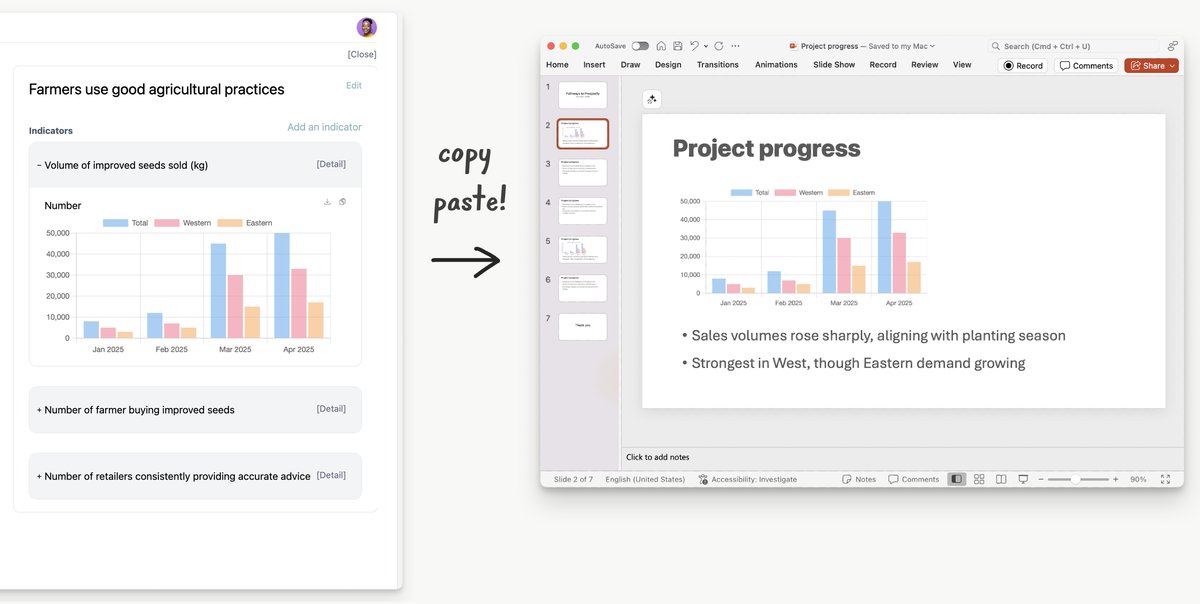
Whether it’s for a meeting or a report, Paths makes your data presentation-ready. It neatly lays out qualitative data and automatically charts quantitative data.

You can download high-resolution visuals or paste them straight into your documents.

Present data beautifully

Measurement Frameworks

Build the measurement framework that fits your portfolio. Paths’ flexible design lets you set up the levels, indicators, and targets you need — and share it with your team so everyone’s aligned.

Measurement Framework

Easy aggregation

No more error-prone manual aggregation. Once you’ve set up your measurement framework, you can choose to make indicators available to projects. Projects can select these from a menu and add them to their measurement plans.

Any data collected against shared indicators is automatically aggregated and displayed in your overarching framework. And if you need to, you can adjust numbers easily.

Aggregation

Learn more about Paths: